
目次
概要
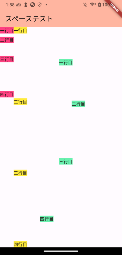
スペースを空けるには以下の三通りがある。
- SizeBox
- Spacer
- Padding
場合によって使い分けてレイアウトを自由自在に設置しよう。
ソースコード
import 'package:flutter/material.dart';
import 'package:flutter_riverpod/flutter_riverpod.dart';
import 'package:firebase_core/firebase_core.dart';
import 'firebase_options.dart';

import 'Default/DefaultView.dart';

void main() async{
  WidgetsFlutterBinding.ensureInitialized();
  await Firebase.initializeApp(
    options: DefaultFirebaseOptions.currentPlatform,
  );

  runApp(const ProviderScope(child: MyApp()));
}

class MyApp extends StatelessWidget {
  const MyApp({super.key});

  @override
  Widget build(BuildContext context) {
    return MaterialApp(
      title: 'Flutter Demo',
      theme: ThemeData(
        colorScheme: ColorScheme.fromSeed(seedColor: Colors.deepOrange),
        useMaterial3: true,
      ),
      home: DafaultView(),
    );
  }
}
import 'package:flutter/material.dart';

class DafaultView extends StatefulWidget {
  const DafaultView({super.key});

  @override
  State<DafaultView> createState() => _DafaultViewState();
}

class _DafaultViewState extends State<DafaultView> {
  @override
  Widget build(BuildContext context) {
    return Scaffold(
      appBar: AppBar(
        backgroundColor: Theme.of(context).colorScheme.inversePrimary,
        title: Text("スペーステスト"),
      ),
      body: Row(
        children: [
          sizeBoxSpace(),
          autoSpacer(),
          paddinSpace()
        ],
      )
    );
  }

  Widget sizeBoxSpace() {
    return const Column(
      children: <Widget>[
        Text("一行目",
          style: TextStyle(
            backgroundColor: Colors.yellow,
          ),
        ),
        SizedBox(height: 10),
        Text("二行目",
          style: TextStyle(
            backgroundColor: Colors.yellow,
          ),
        ),
        SizedBox(height: 40),
        Text("三行目",
          style: TextStyle(
            backgroundColor: Colors.yellow,
          ),
        ),
        SizedBox(height: 90),
        Text("四行目",
          style: TextStyle(
            backgroundColor: Colors.yellow,
          ),
        ),
      ],
    );
  }

  Widget autoSpacer() {
    return const Column(
      children: <Widget>[
        Text("一行目",
          style: TextStyle(
            backgroundColor: Colors.yellow,
          ),
        ),
        Spacer(),
        Text("二行目",
          style: TextStyle(
            backgroundColor: Colors.yellow,
          ),
        ),
        Spacer(),
        Text("三行目",
          style: TextStyle(
            backgroundColor: Colors.yellow,
          ),
        ),
        Spacer(),
        Text("四行目",
          style: TextStyle(
            backgroundColor: Colors.yellow,
          ),
        ),
      ],
    );
  }

  Widget paddinSpace() {
    return const Column(
      children: <Widget>[
        Padding(padding: EdgeInsets.all(100),
          child: Text("一行目",
            style: TextStyle(
              backgroundColor: Colors.yellow,
            ),
          ),
        ),
        Padding(padding: EdgeInsets.fromLTRB(90, 10, 10, 120),
          child: Text("二行目",
            style: TextStyle(
              backgroundColor: Colors.yellow,
            ),
          ),
        ),
        Padding(padding: EdgeInsets.all(40),
          child: Text("三行目",
            style: TextStyle(
              backgroundColor: Colors.yellow,
            ),
          ),
        ),
        Padding(padding: EdgeInsets.fromLTRB(20, 120, 140, 20),
          child: Text("四行目",
            style: TextStyle(
              backgroundColor: Colors.yellow,
            ),
          ),
        ),
      ],
    );
  }
}
デモ動画
詳細
主にColumnやRowで使われると思う。
SizeBox
// 横方向に10だけスペースを空ける場合
SizedBox(width: 10)

// 縦方向に10だけスペースを空ける場合
SizedBox(height: 10)
RowやColumnの中にUIを羅列していると思うが、それぞれのUIの間にSizeBoxを書くことでUI間の隙間を設定することができる。
Rowは横に並べるので使うならSizedBox(width: 10)、Columnは縦に並べるので使うならSizedBox(height: 10)を使ってUIの距離を調整することになる。
「マージン」と言った方がわかりやすい人もいるだろうか。
Spacer
Spacer()Spacer()は自動的にスペースを設定してくれる。
概要としては、まずUIを設置する。そしてUIを設置した後の余白をSpacer()を書いたところだけ均等に空ける。
UIを等間隔で設置したい時に使える。
Padding
// 上下左右をそれぞれ個別に設定する場合
Padding(padding: EdgeInsets.fromLTRB(90, 10, 10, 120),
  child: Text("二行目",
    style: TextStyle(
      backgroundColor: Colors.yellow,
    ),
  ),
)

// 上下左右をまとめて設定する場合
Padding(padding: EdgeInsets.all(40),
  child: Text("三行目",
    style: TextStyle(
      backgroundColor: Colors.yellow,
    ),
  ),
)
Paddingというオブジェクトの中に設定する場合。
paddingに上下左右の隙間を設定し、childに表示するUIを設定する。
ただし、こちらはMarginではなく、Paddingなので、ベースとなるUIがあり、Paddingの設定値分だけその内側にchildに設定したUIを表示する。
ちなみに、上下と左右の範囲で設定するなど、他にも設定方法はある。
個人的には、SizeBoxやSpacerを使う場合が多いと思う。
レイアウトを設定する時はPaddingをたくさん使って複雑なレイアウトにならないようにしよう。