目次
概要
アプリを開発する上での必須項目。タップしたときに何かの処理を行うUI。
もはやこれ以上概要と言えるものはないだろう。
ソースコード
pubspec.yaml
dependencies:
  flutter:
    sdk: flutter

  # The following adds the Cupertino Icons font to your application.
  # Use with the CupertinoIcons class for iOS style icons.
  cupertino_icons: ^1.0.2
  flutter_riverpod: ^1.0.0-dev.7 //ここ追加

// 中略

  # To add assets to your application, add an assets section, like this:
  assets:
    - images/
アプリ起動部分
import 'package:flutter/material.dart';
import 'package:flutter_riverpod/flutter_riverpod.dart';
import 'ButtonTest/ButtonTestView.dart';

void main() {
  runApp(ProviderScope(child: MyApp()));
}

class MyApp extends StatelessWidget {
  const MyApp({super.key});

  @override
  Widget build(BuildContext context) {
    return MaterialApp(
      title: 'Flutter Demo',
      theme: ThemeData(
        colorScheme: ColorScheme.fromSeed(seedColor: Colors.deepOrange),
        useMaterial3: true,
      ),
      home: const ButtonTestView(title: 'Flutter Demo Home Page'),
    );
  }
}
View部分
import 'package:flutter/material.dart';
import 'package:flutter/widgets.dart';
import 'package:flutter_riverpod/flutter_riverpod.dart';

import 'ButtonTestViewModel.dart';

class ButtonTestView extends ConsumerWidget {
  const ButtonTestView({Key? key, required this.title}) : super(key: key);
  final String title;

  @override
  Widget build(BuildContext context, WidgetRef ref) {
    final _viewModel = ref.watch(myHomeViewModelProvider);

    var textButton = TextButton(
      onPressed: () { _viewModel.tapped(); },
      onLongPress: () { _viewModel.longTapped(); },
      style: TextButton.styleFrom(
        backgroundColor: Colors.white10,
        foregroundColor: Colors.cyan,
      ),
      child: Text("長押しも対応"),
    );

    var outlinedButton = OutlinedButton(
        onPressed: () { _viewModel.tapped(); },
        style: OutlinedButton.styleFrom(
            backgroundColor: Colors.white10,
            foregroundColor: Colors.black,
            disabledBackgroundColor: Colors.black26,
            disabledForegroundColor:  Colors.black54
        ),
        child: Text("外枠付きボタン!")
    );

    var disEnabledOutlinedButton = OutlinedButton(
        onPressed: null,//() { _viewModel.tapped(); },
        style: OutlinedButton.styleFrom(
          backgroundColor: Colors.white10,
          foregroundColor: Colors.black,
          disabledBackgroundColor: Colors.black26,
          disabledForegroundColor:  Colors.black54
        ),
        child: Text("外枠付きボタン!")
    );

    var elevatedButton = ElevatedButton(
      onPressed: () { _viewModel.tapped(); },
      style: ElevatedButton.styleFrom(
        foregroundColor: Colors.white,
        backgroundColor: Colors.red,
        elevation: 5,
      ),
      child: Text("影付きボタン!"),
    );

    var goodButton = IconButton(
        onPressed: () { _viewModel.good(); },
        icon: Icon(Icons.favorite_border, color: Colors.pink),
        iconSize: 24,
    );

    var iconTextButton = OutlinedButton.icon(
      onPressed: () { _viewModel.tapped(); },
      icon: Icon(Icons.check_circle_outline_outlined, color: Colors.green),
      label: Text('チェックボタン'),
    );

    // 画像のボタン
    var imageButton = Center(
      child: Container(
        width: 120,
        height: 120,
        decoration: BoxDecoration(
          color: Colors.white,
          borderRadius: BorderRadius.circular(0),
          image: DecorationImage(
            image: AssetImage(
              'images/logo_s.png',
            ),
            fit: BoxFit.cover,
          ),
        ),
        child: Material(
          color: Colors.transparent,
          child: InkWell(
            borderRadius: BorderRadius.circular(0),
            onTap: () {
              _viewModel.tapped();
            },
          ),
        ),
      ),
    );

    return Scaffold(
      appBar: AppBar(
        backgroundColor: Theme.of(context).colorScheme.inversePrimary,
        title: Text("ButtonTestView"),
      ),
      body: Center(
        child: Column(
          mainAxisAlignment: MainAxisAlignment.center,
          children: <Widget>[
            textButton,
            outlinedButton,
            disEnabledOutlinedButton,
            elevatedButton,
            goodButton,
            iconTextButton,
            imageButton
          ],
        ),
      ),
    );
  }
}
ViewModel部分
import 'package:flutter/widgets.dart';
import 'package:flutter_riverpod/flutter_riverpod.dart';
import 'ButtonTestRepository.dart';

final myHomeViewModelProvider = ChangeNotifierProvider((ref) => ButtonTestViewModel(repository: ref.read(buttonTestRepositoryProvider)));

class ButtonTestViewModel extends ChangeNotifier {

  ButtonTestRepository? repository;
  ButtonTestViewModel({this.repository});

  void tapped() {
    this.repository?.tapped();
  }

  void longTapped() {
    this.repository?.longTapped();
  }

  void good() {
    this.repository?.good();
  }
}
Repository部分
import 'package:flutter_riverpod/flutter_riverpod.dart';
import 'ButtonTestModel.dart';

final buttonTestRepositoryProvider = Provider((ref) => ButtonTestRepositoryImpl(model: ref.read(buittonTestModelProvider)));

abstract class ButtonTestRepository {
  void tapped();
  void longTapped();
  void good();
}

class ButtonTestRepositoryImpl implements ButtonTestRepository {
  ButtonTestRepositoryImpl({required ButtonTestModel model}): _model = model;

  final ButtonTestModel _model;

  void tapped() {
    print("タップされたよ!");
  }

  void longTapped() {
    print("長押しされたよ!");
  }

  void good() {
    print("いいね!");
  }
}
Model部分
import 'package:flutter_riverpod/flutter_riverpod.dart';
final buittonTestModelProvider = Provider((ref) => ButtonTestModel());
class ButtonTestModel {
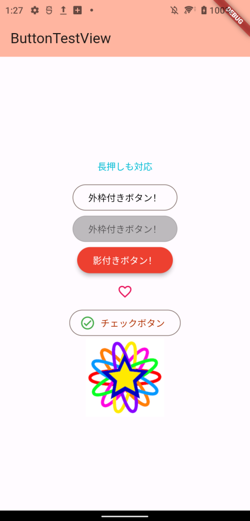
}スクリーンショット
詳細
ボタンの種類
Flutterで作成するボタンには以下の種類がある。
| ボタンの種類 | 概要 |
| TextButton | 文字のみ |
| OutlinedButton | 枠線付きボタン |
| ElevatedButton | 影があるボタン |
| IconButton | 画像付きボタン |
ボタンのプロパティ
ボタンのプロパティは以下がある。
| プロパティ | 内容 |
| onPressed | タップした時の処理 |
| onLongPress | 長押しした時の処理 |
| child | ボタンに表示するUIの設定 |
| style | 文字の見た目の設定 |
| .iconのボタンの設定 | OutlinedButton.iconなどの設定値 |
| icon | ボタンのアイコンを設定する |
| label | ボタンに表示するUIの設定 |
| ElevatedButtonのプロパティ | |
| elevation | 影の位置(大きければ大きいほど影のぼかしが大きくなる) |
また、ボタンの文字色や背景色は以下のように設定している。
| プロパティ | 内容 |
| foregroundColor | 文字色、アイコンの色 |
| backgroundColor | 背景色 |
| disabledForegroundColor | ボタンが押せない時(onPressedがnullの場合)の文字色、アイコンの色 |
| disabledBackgroundColor | ボタンが押せない時(onPressedがnullの場合)の背景色 |
別のページで再度記載するもの
- 画像のボタン
- アーキテクチャを意識した実装